Project Objective:
Focus on manipulation and composition of type to convey a message. Create a poster to persuade viewers to attend an event, which was assigned to each of us. Depending on what event you were assigned, pick one of the people to make the poster about and communicate their contribution.
Research:
I was assigned the event "Paper Constellations" and chose Michael Cunningham as my person of focus. Michael Cunningham is a Pulitzer Prize-winning novelist and screenwriter who’s best known for his novel The Hours. The Hours explores the passage of time as it pays tribute to Virginia Woolf’s Mrs. Dalloway. The novel follows three women, living in different decades who will never meet, and their ordinary lives through the trauma of each of their generations.
I then picked out five words I associated with Cunningham and his work:
Fictional, activism, time, future, and relatable
From the five words I came up with, I narrowed it down to two and brainstormed emotions and subjects associated with them.
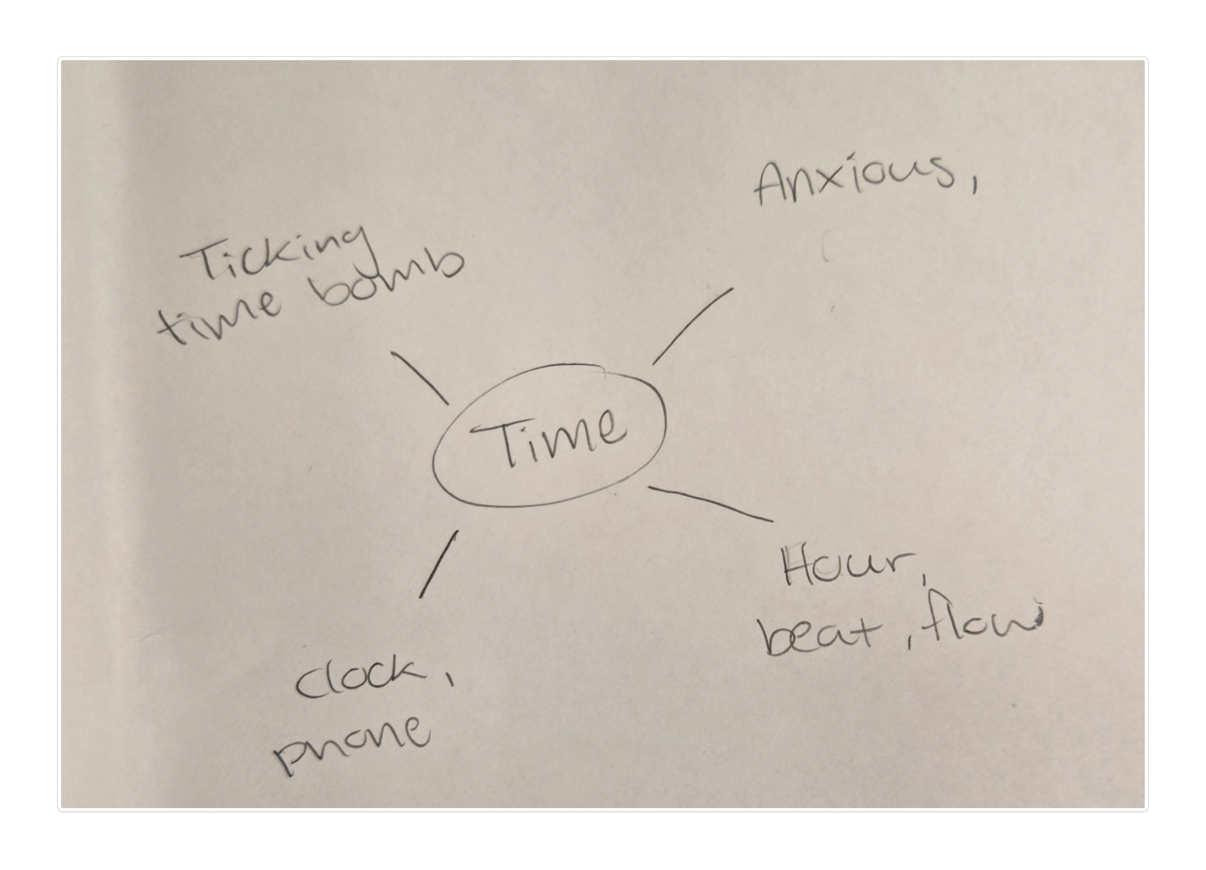
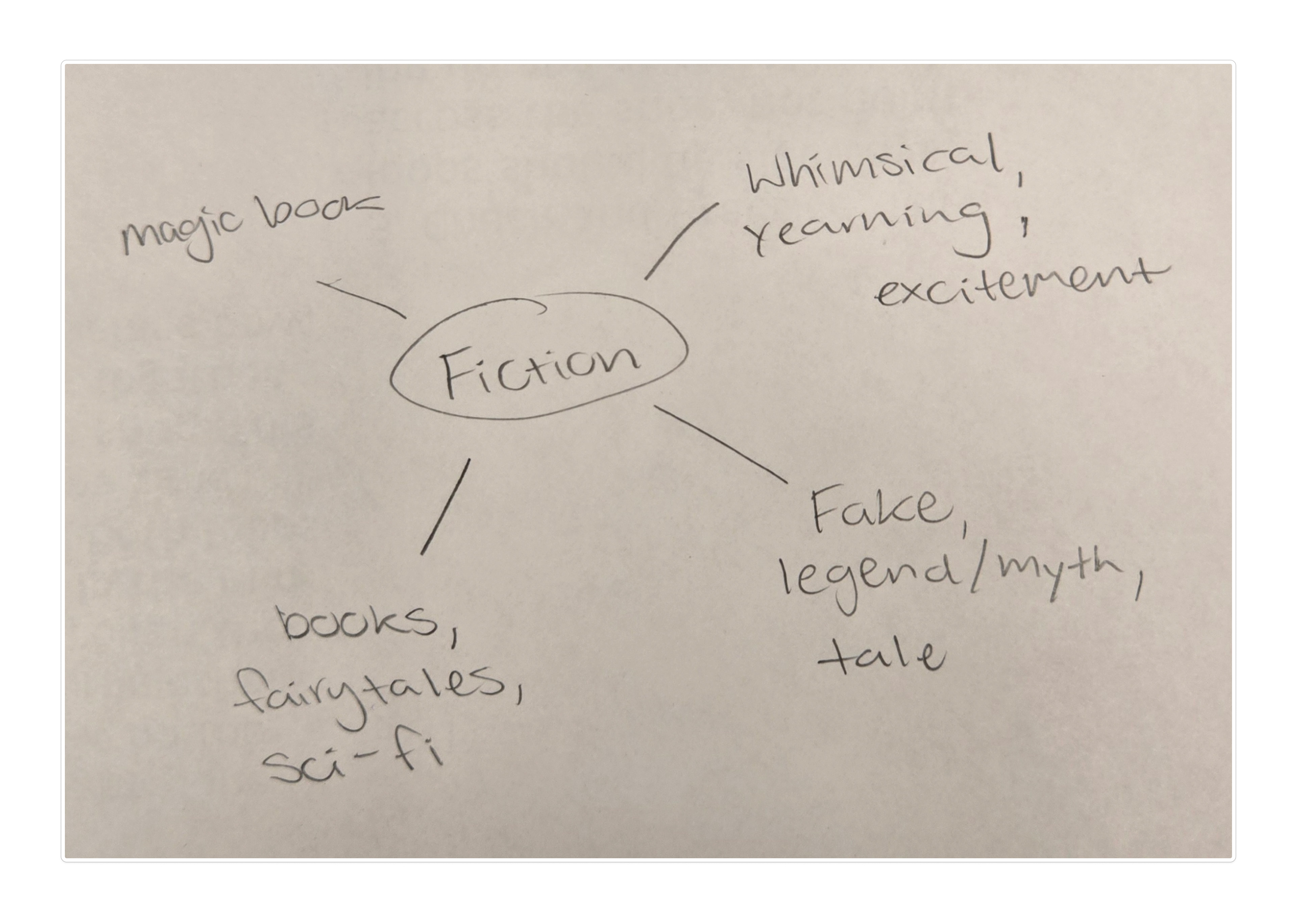
Between these two words, time was the strongest to continue with after some feedback from my peers. After settling on a word, I sketched out basic thumbnail sketches of potential compositions.
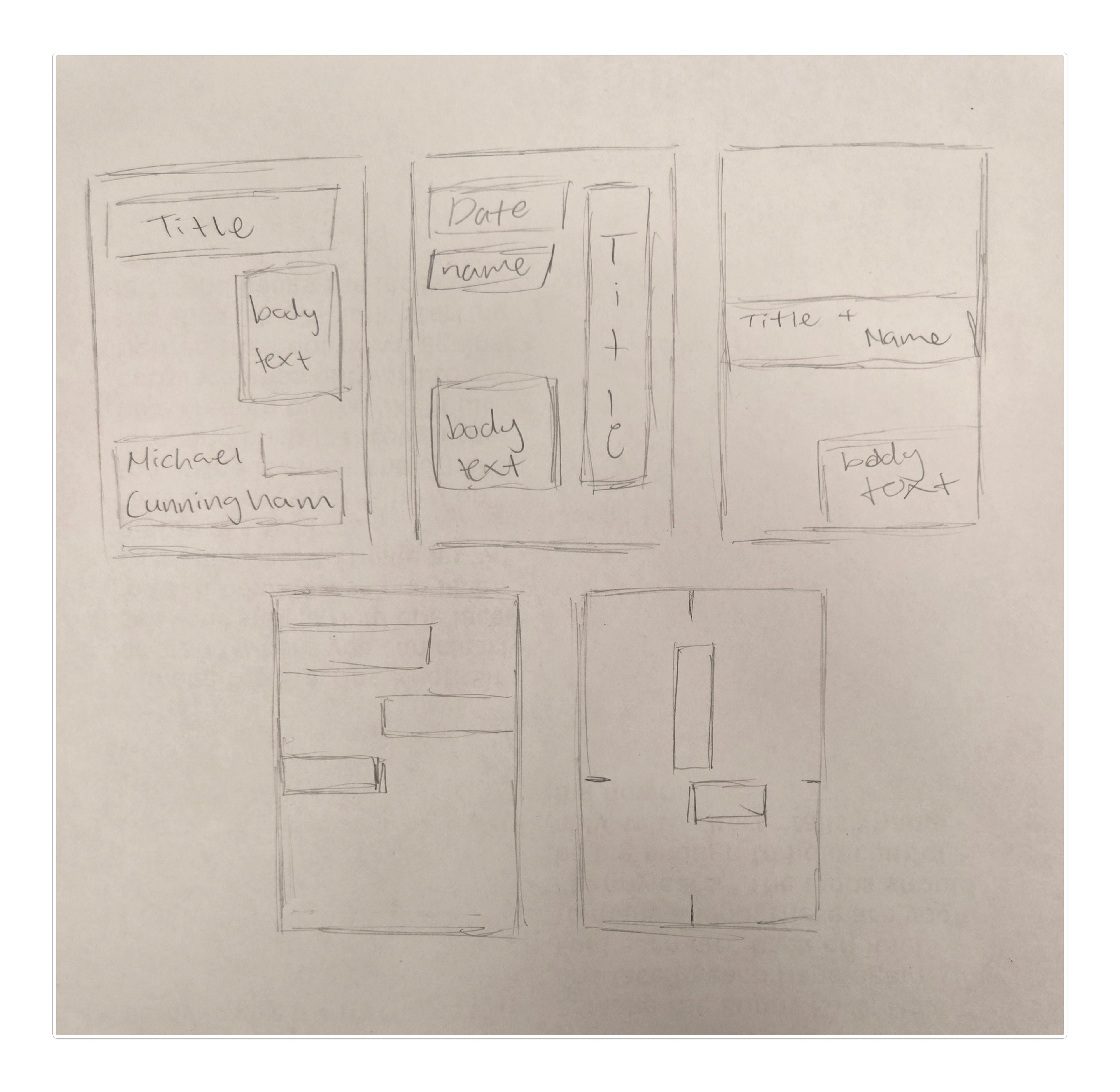

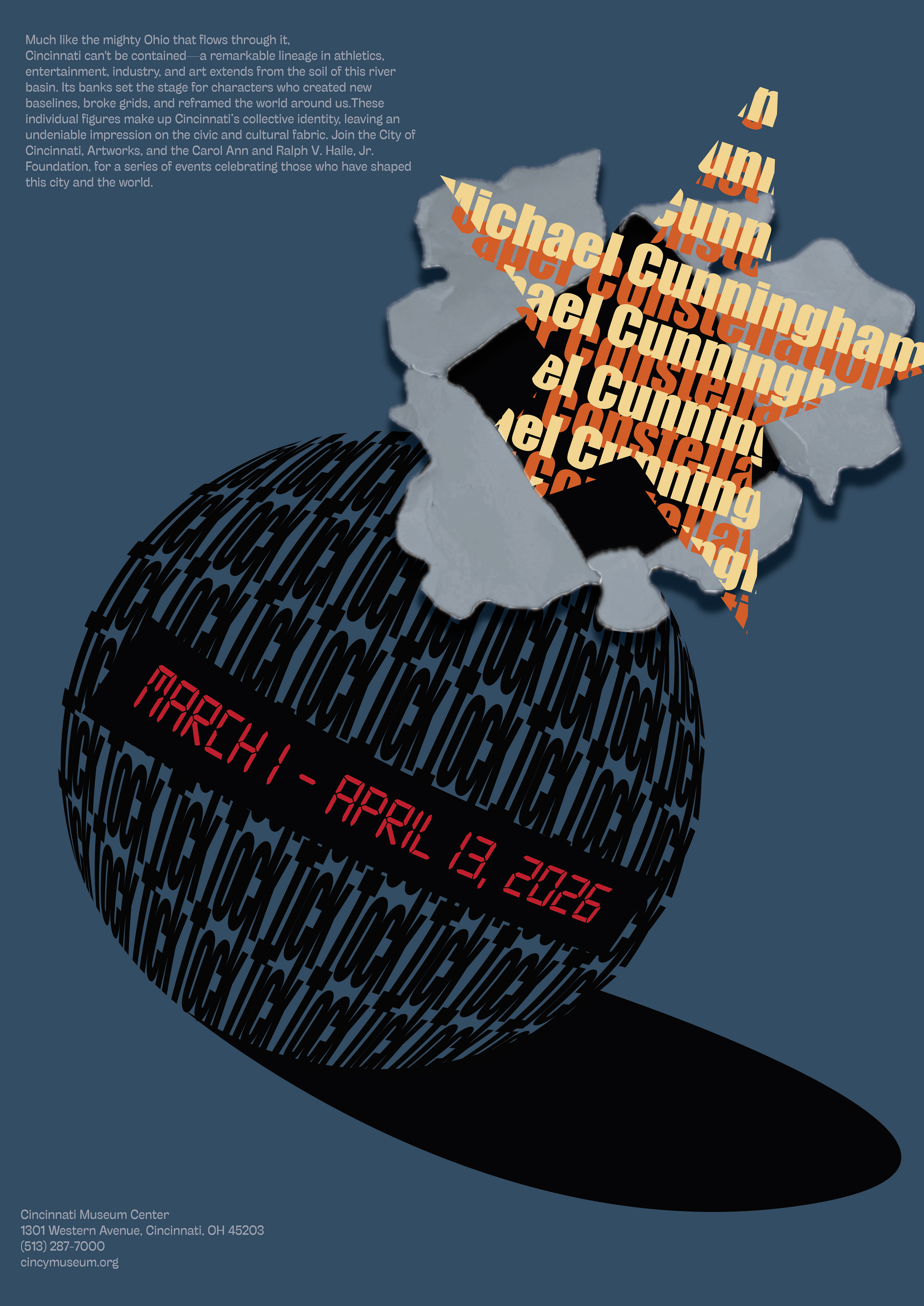
From there, I made the first digital iterations after finally settling on the idea of a ticking time bomb. The digital iterations were also the first time I properly added the other information that the poster required: event name, person's name, March 1-April 13, 2026, museum information, and the paragraph provided to us.
First digital iterations:
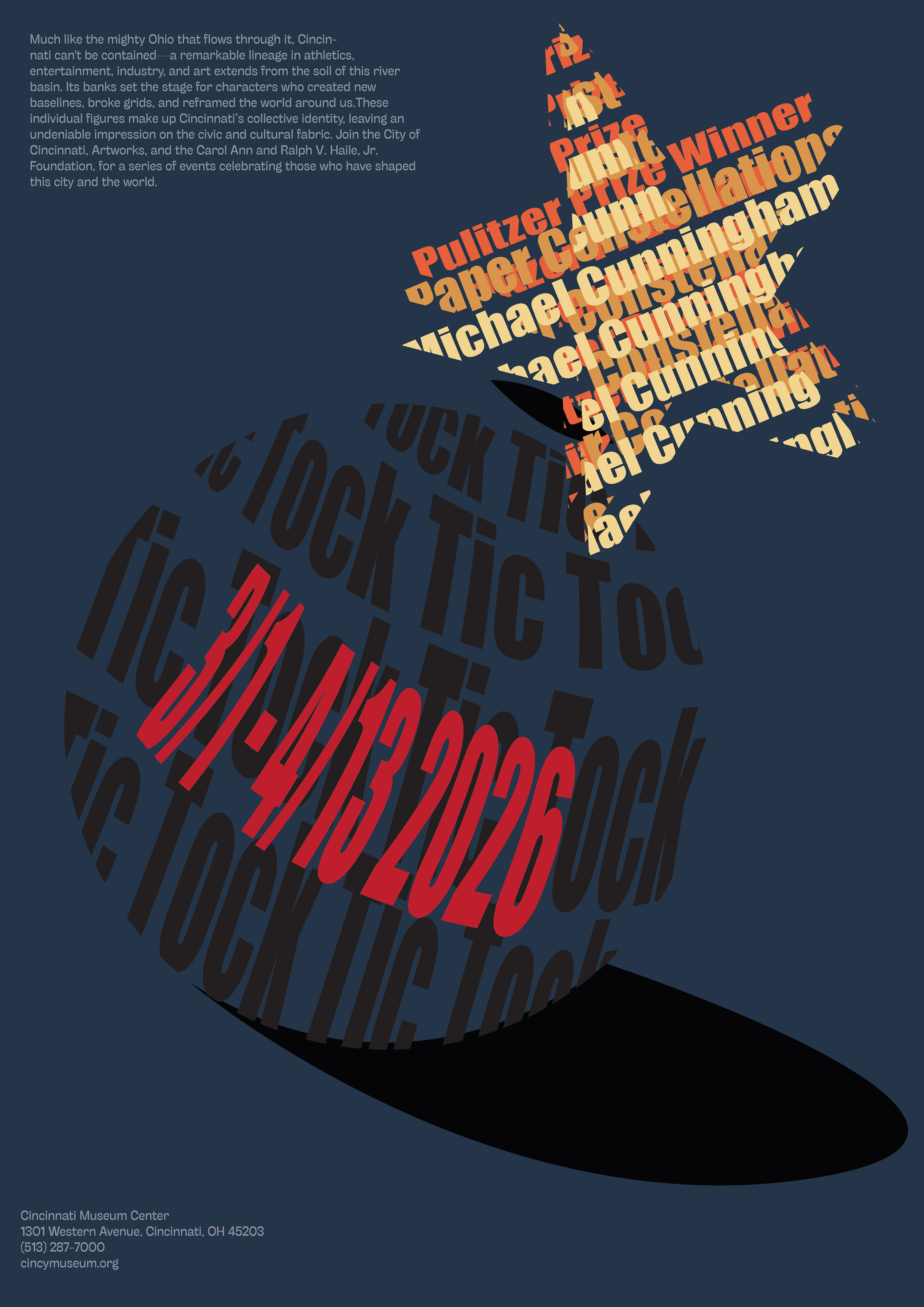
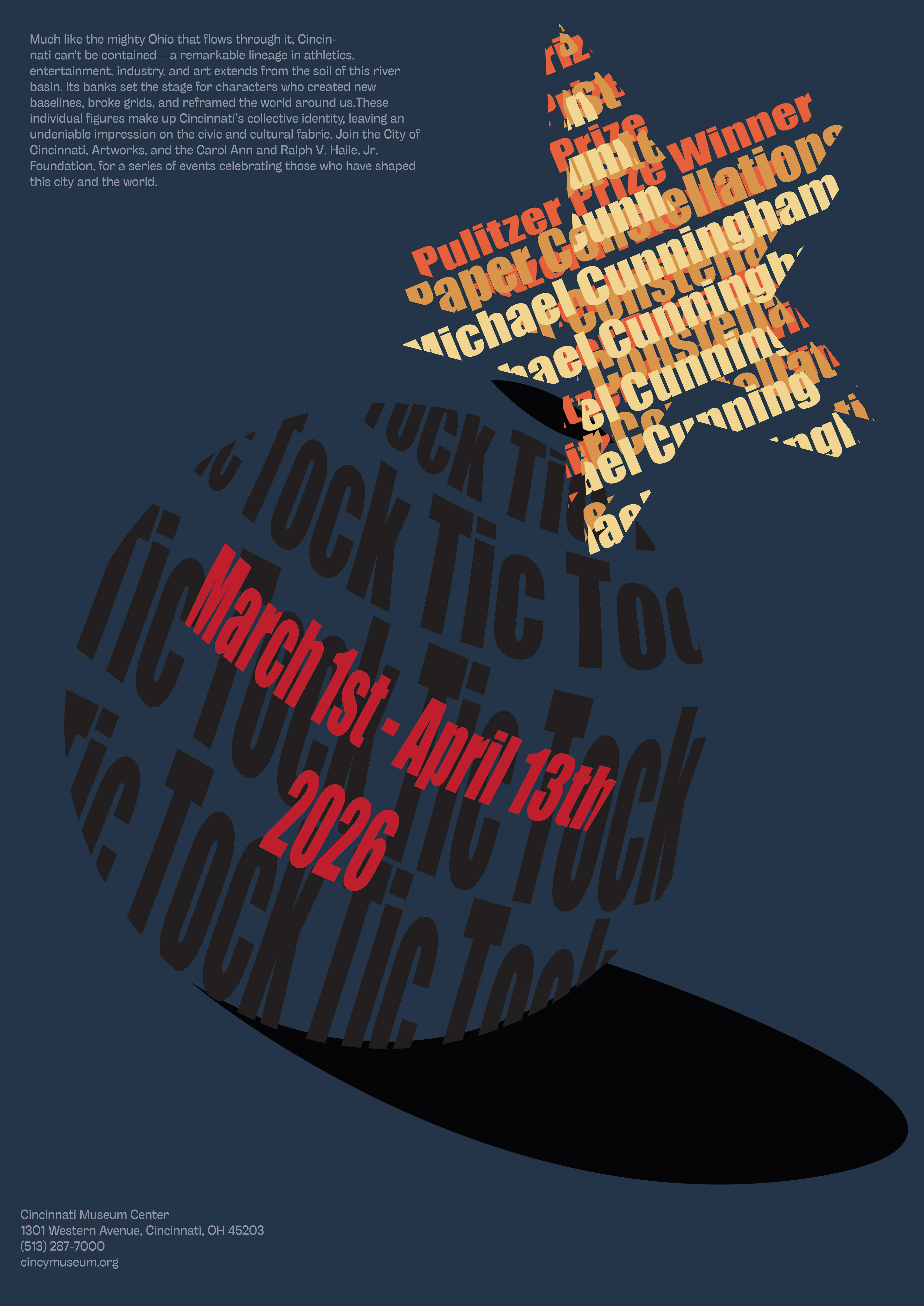
I wanted to work with a dark color palette so that the stars containing Michael's name and the event name stood out more, as well as the date on the bomb. For typeface, I settled on using a bold, sans serif one that evoked urgency and looked impactful.
After experimenting with the idea of the bomb, I referred back to my notes and decided to try the concept of an alarm clock ringing.
Iterations 3 & 4:
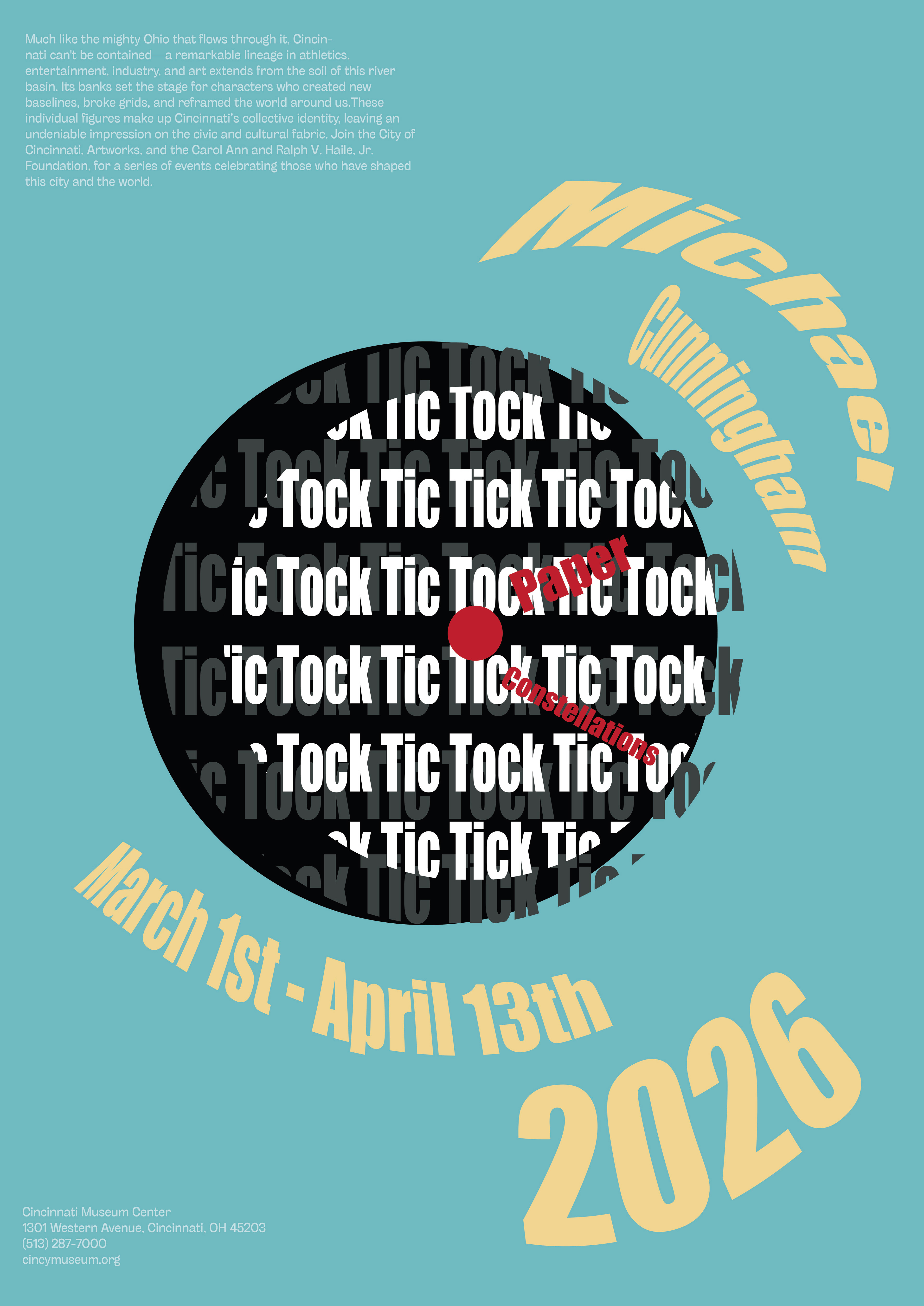
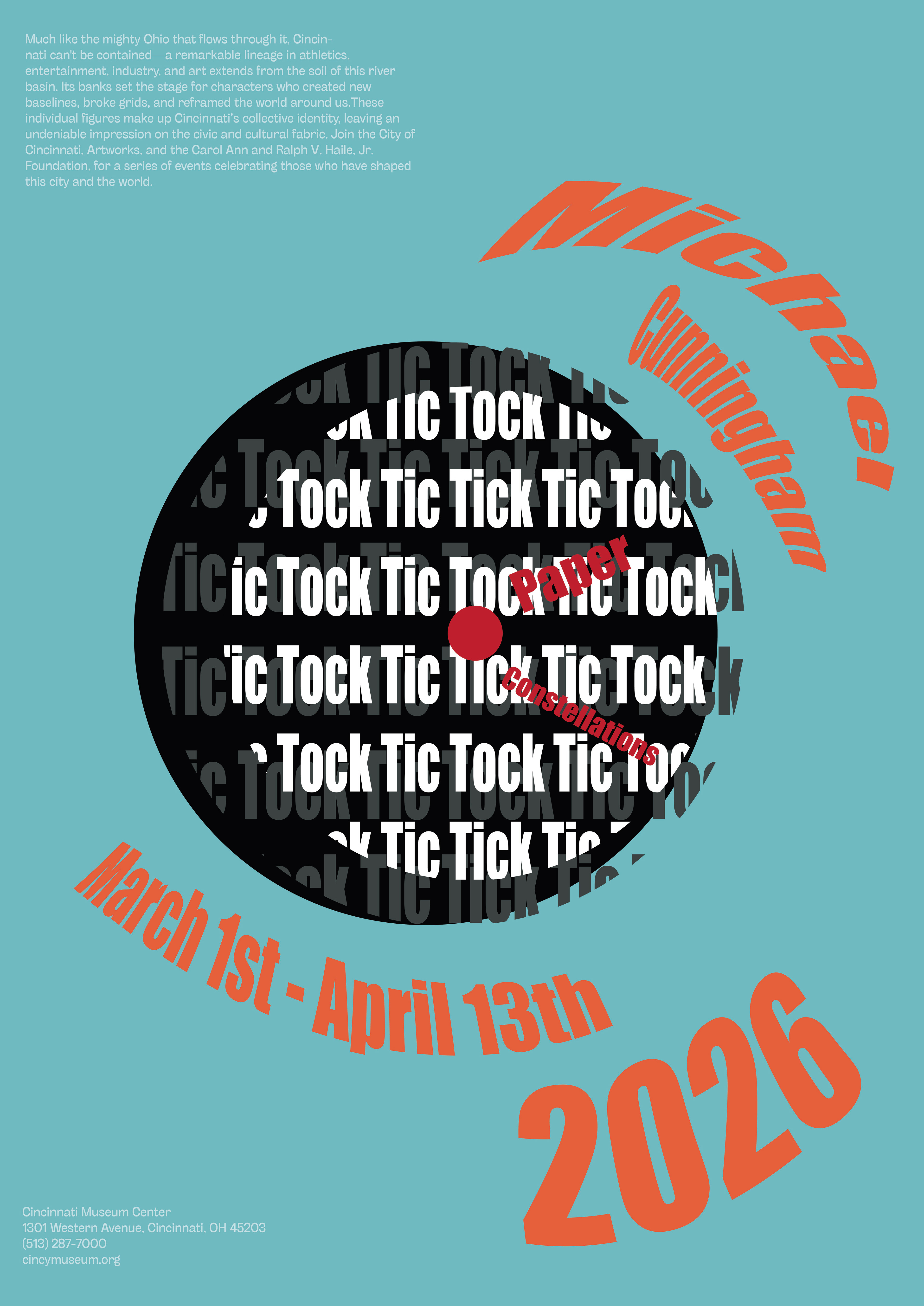
Iterations 5 & 6:
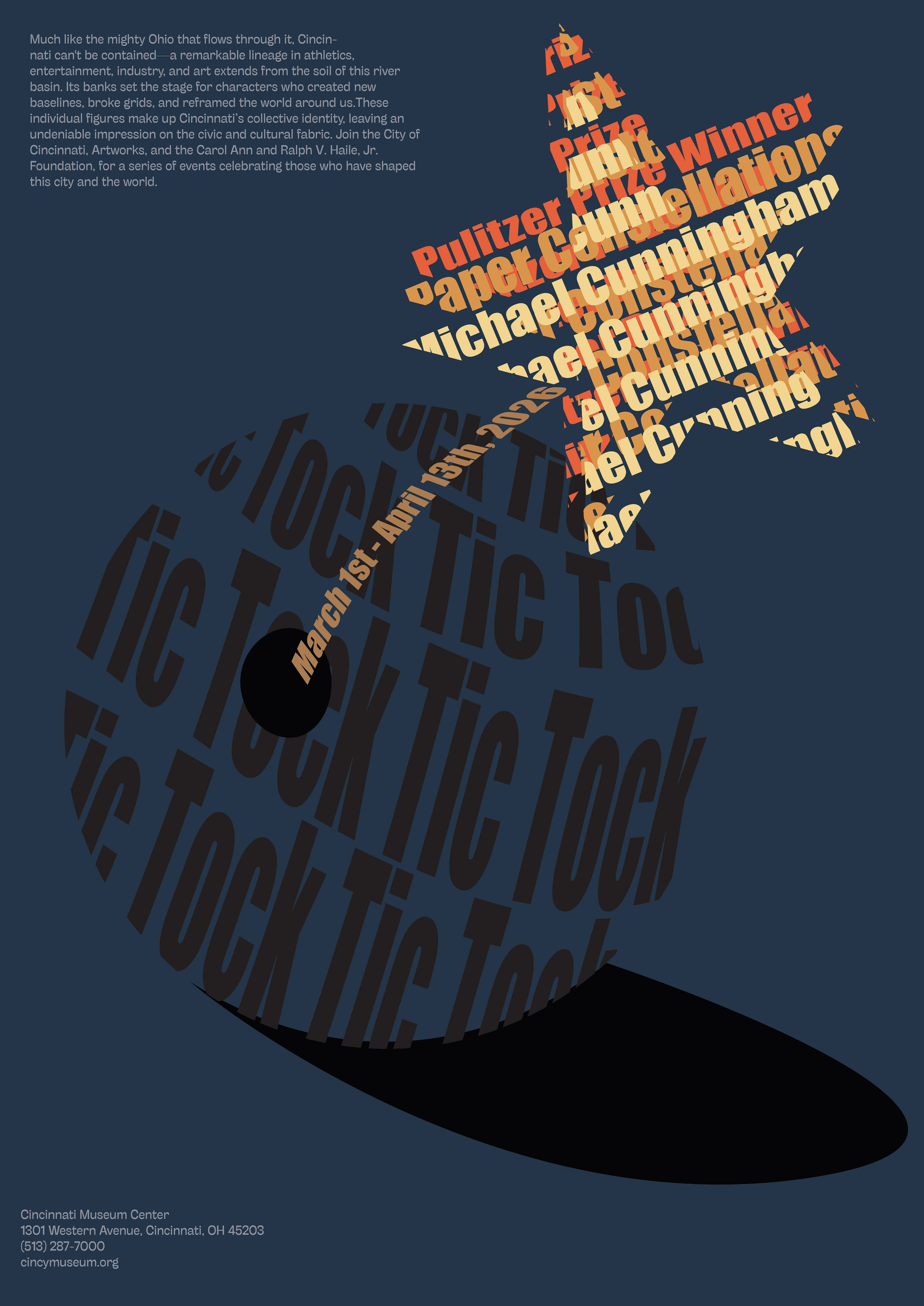
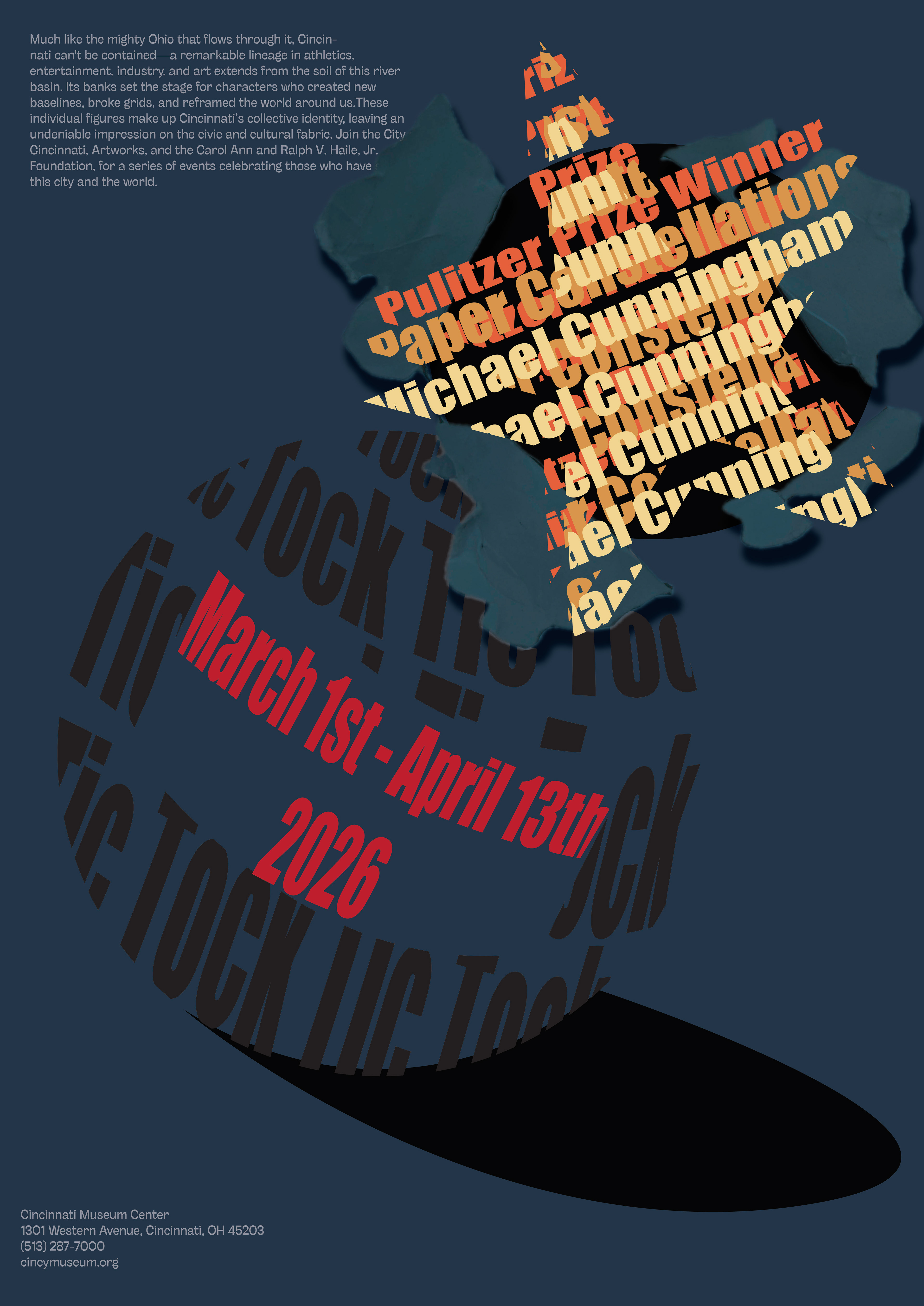
After some feedback, I chose to make the background color slightly lighter, make the bomb black, and make the text "tic tock" less readable so that it would be lower in the hierarchy. I also made changed the typeface of the date so that it better resembled a digital clock. All of these changes are what led to the final poster design.
Final design: